
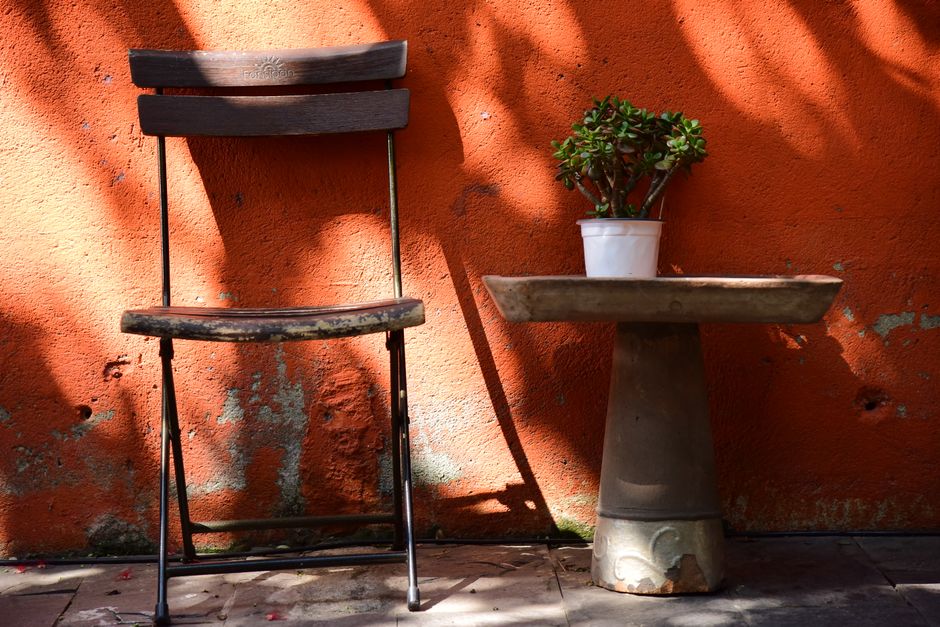
Terracotta Tones: Warm Earth Instead of Cool Walls
Rust-red, sand-coloured, fired: earth tones are replacing the cool grey of the past decade. From wall paint to ceramics and the question of why a room in terracotta looks different in the evening than in the morning.
Some colours slip past a wall almost unnoticed. Others recalibrate an entire room. Terracotta belongs to the second group. Not a loud hue, but a warm foundation that evokes sun-baked clay and stone kissed by sunlight. After years in which living spaces were meant to read as cool, smooth and beige, something is shifting, felt in wall paint, ceramics and textiles.
- Farrow & Ball curates several terracotta shades, from pale Faded Terracotta to deep Red Earth
- Interior designer Christopher Sitzler describes a 2026 counter-movement away from cold, smooth interiors toward pigment, depth and natural materials
- A terracotta tone such as Red Earth visibly reacts to daylight, appearing deeper and warmer toward evening
A colour family with many faces
Terracotta is not a single shade but an entire family. Farrow & Ball alone lists four under that banner: Faded Terracotta, a soft, pale orange with a sandy character that recalls terracotta pots bleached by the sun; Naperon, peachy and lighter; Red Earth, a warm terracotta with red-yellow pigments; and Marmelo, which mediates between these poles. Anyone who thinks of a single brick tone vastly underestimates the range of this palette.
Red Earth most clearly reveals what makes terracotta special. It responds to changes in daylight, growing deeper and cosier by evening, an effect smooth, neutral wall paints rarely deliver. A room in this hue literally shifts with the sun.
The retreat from cold and smooth
Interior designer Christopher Sitzler puts it plainly for 2026 trends: the past design decade leaned cold, smooth and technological. Now the emphasis is on warmer, more human elements, less Scandi-beige, more pigment, depth and natural materials like wood, stone and metal. Terracotta slots neatly into this movement, not as a loud trend colour but as part of a larger return to substance.
House & Garden notes a similar shift: consumers are moving away from cool, clear reds toward warmer, earthier variants. Colour consultant Joa Studholme of Farrow & Ball calls these shades organic, “from the soil,” grown from the earth rather than a design board. The same source points to the rising popularity of colour drenching, painting walls, woodwork and ceilings in a single tone, which makes a terracotta room feel even more cohesive.
A Sicilian palazzo as reference
How thoroughly terracotta can run through a space is shown by a seventeenth-century palazzo in Noto, documented by AD Magazine. There, a staircase with cocciopesto finish, a traditional floor made from crushed terracotta, binds the three storeys. Owner Riccardo Grassi describes how Sicilian light seems to repaint the building several times in a single day, from dawn’s rose to the deep blue of night.
Along the Spanish coast the material also appears. In a duplex beach apartment in Altea designed by Viruta Lab, a continuous tiling scheme in green, terracotta and yellow tones, paired with wood, links interiors to the mineral landscape of the Costa Blanca. On the terrace lies a mosaic in Terra and Pine hues, a direct dialogue between fired clay and the Mediterranean.
Terracotta isn’t a wall colour you simply roll on. It’s a light you invite into the wall.
Why Grey Alone No Longer Cuts It
The idea that terracotta is simply replacing the grey of the 2010s one-for-one isn’t backed up by hard evidence. More convincing is the observation of a broader backlash against cool, sleek, tech-inspired interiors and the so-called Scandi-Beige that long reigned as the safe default. House & Garden ties this surge in brown and earth tones to the concept of “soulful minimalism,” where icy hues and sharp lines give way to natural materials, texture, and warm neutrals. For cosy retreats, the magazine recommends deep terracotta or ochre walls.
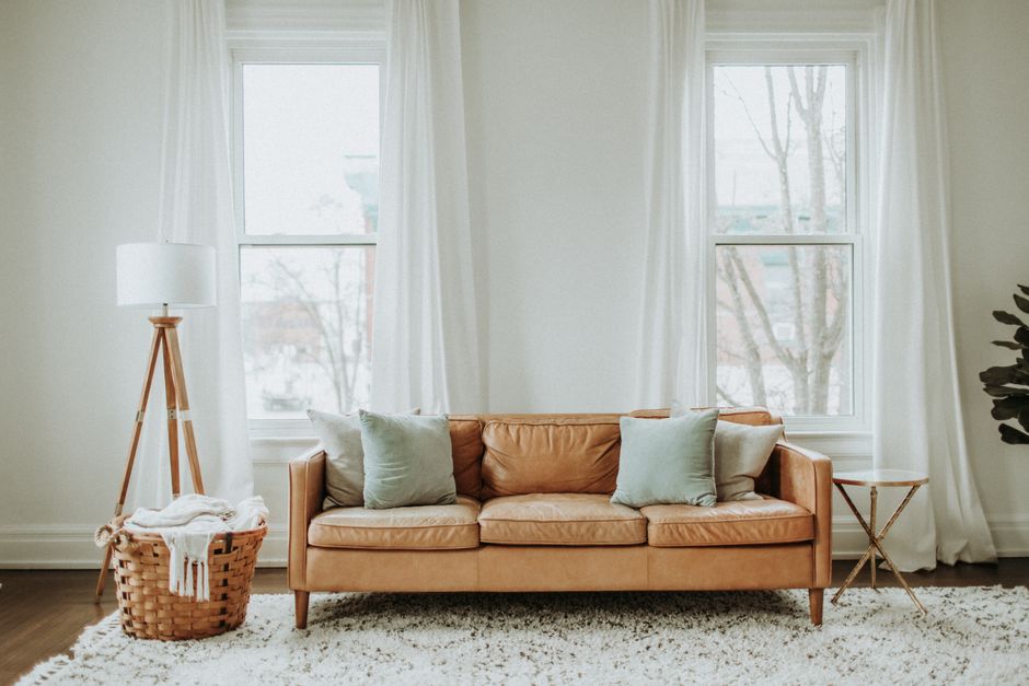
The comeback of ochre tones follows the same logic. In the 1990s ochre was often paired with beige and terracotta, but in the minimalist decades that followed it was dismissed as dated. Now the desire for more natural, expressive spaces is back, and with it the entire ochre colour family.
Where to Start with the Colour
Terracotta doesn’t have to take over the whole flat. A mid-century duo of retro-orange and mocha-brown from the 1970s shows how inviting the combination can look with a darker counterpart, a historical reference frame that’s now being nostalgically revived. If you want to dip a toe in, begin with ceramics, unglazed clay, a linen cushion in sand tones, or a throw pillow before committing to painting an entire wall.
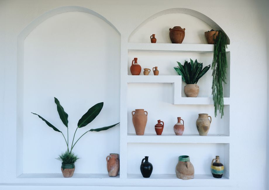
Bolder souls can embrace colour-drenching in a single room, a reading nook, a small guest bathroom, where the impact stays concentrated because no neutral transition tone dilutes the warmth.
Ultimately, it’s not the wall colour alone that decides the mood, but the interplay of light, materials, and time of day. That chemistry can’t be read off a paint-sample card at the DIY store; it has to be experienced in your own space on an actual afternoon.
Quick Answers
▸Is terracotta a single shade or a whole family?
Terracotta refers to an entire colour family, ranging from pale, sandy faded terracotta to deep red-yellow pigmented red earth. Brands like Farrow & Ball offer several distinct shades within it.
▸Does terracotta really replace the grey of the 2010s?
What’s clearer is a wider pushback against cool, smooth interiors and so-called Scandi-Beige. Terracotta is part of this return to warm, natural materials, not the sole successor tone.
▸What’s the easiest way to introduce terracotta?
Start with ceramics, unglazed clay, or textiles in sand and earth tones. If you’re ready to go further, try colour-drenching in one manageable room instead of the whole apartment.
Image credits: cover image and article photos Pexels.


