Background · Lighting
Lighting before furniture: the order of a room
Plan lighting before furniture: layers, colour temperature and controls shape luxury residential lighting and keep expensive furnishings from looking flat.

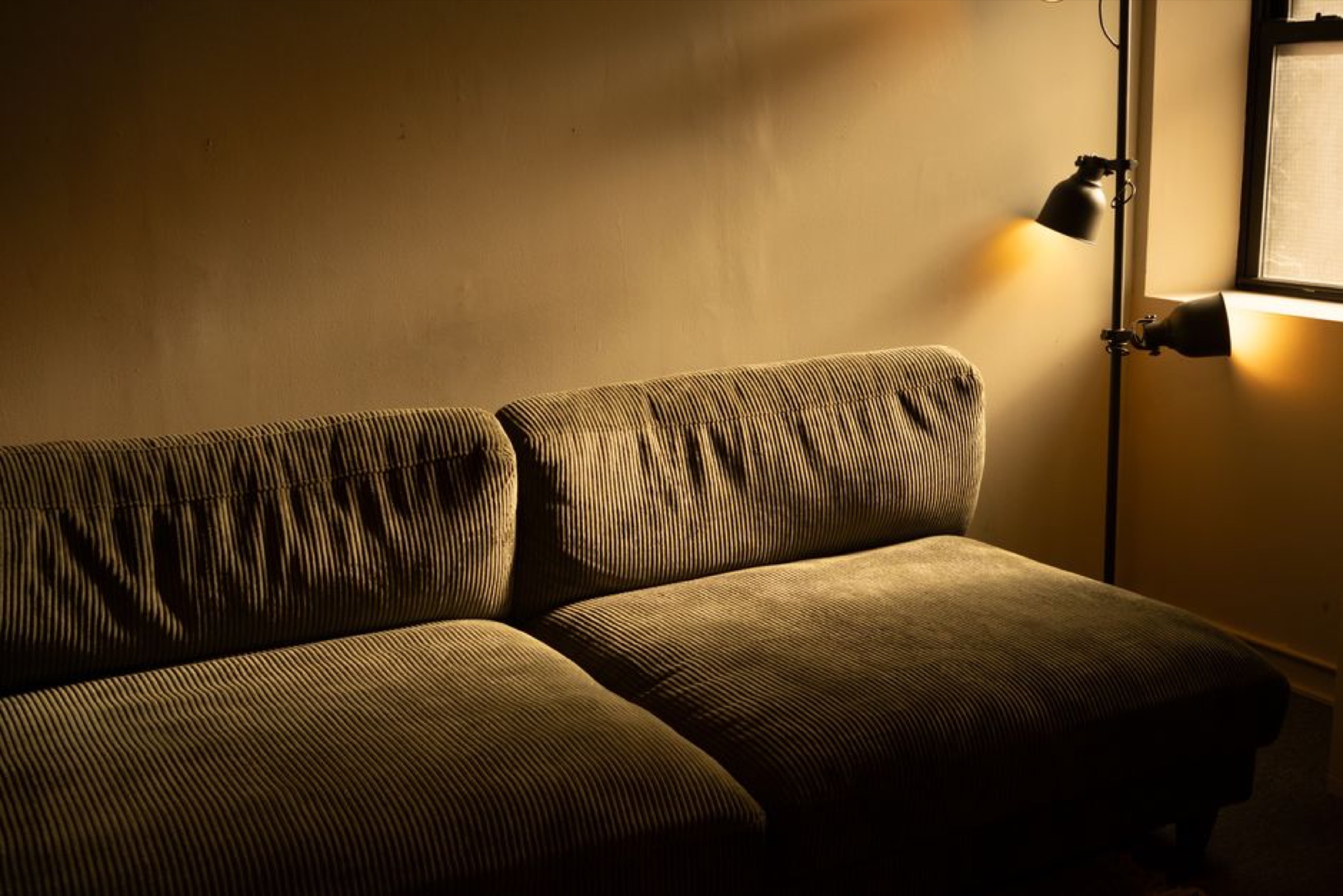 Interiors
Plan lighting before furniture: layers, colour temperature and controls shape luxury residential lighting and keep expensive furnishings from looking flat.
Expensive furniture looks flat when lighting is an afterthought. In luxury residential lighting, order matters: layers, colour temperature and controls come before furniture. Reverse that order and you pay for material quality but often get an ordinary visual result.
Lighting a home starts with what each room is for. Ambient light provides orientation and a legible sense of depth. It distributes brightness so that routes, surfaces and transitions are free of harsh shadows.
Accent lighting creates hierarchy. It brings out material, texture and volume, separating foreground from background. Without this layer, even fine surfaces look flat because the eye finds nothing to focus on.
Task lighting serves a specific use: reading on the sofa, cooking at the worktop, dressing in front of the mirror. It must provide enough local light with little glare and must not replace ambient light. The three layers work together; no single one can carry a sophisticated living space alone.
Designers arrange the layers around use and daily routines. Catalogue images rarely set the pace. A room used only as an evening lounge needs a different balance from a combined living room and study. Add layers late and wiring and placement are often constrained, at the expense of architectural calm.
Colour temperature describes how warm or cool a light source appears, measured in Kelvin. Living spaces generally suit warmer spectra, which render skin tones, wood and textiles more softly. Cooler values suit places where alertness and contrast take priority, such as a kitchen area or desk.
According to the planning guide licht.wissen 01 from the Fördergemeinschaft Gutes Licht (licht.de), warm white light at around 2,700 to 3,300 Kelvin feels homely; neutral white ranges from 3,300 to 5,300 Kelvin, and daylight white sits above that. The same series associates warm tones with relaxed living and cool tones with functional areas.

The CRI (Colour Rendering Index, often expressed as Ra in German usage) indicates how faithfully colours appear under a light source. A high CRI matters in interiors with fine materials, since marble, fabrics and finishes can otherwise look dull or inaccurate. The residential guide licht.wissen 14 recommends warm white LEDs with a colour rendering rating of at least Ra 80 for living spaces; for reading and dining it cites Ra 90 or higher as better practice. The guide licht.wissen 01 also recommends at least Ra 80 indoors.
Absolute lux figures and fixed Kelvin values are not ends in themselves at home. What matters is the balance between daylight, room colour and use. As a guide, licht.wissen 14 recommends 500 lux or more in the kitchen where possible, including on work surfaces, for safety. For a home office, the guide points to 300 to 500 lux as the general room level and 500 lux for reading, based on workplace lighting requirements under DIN EN 12464-1.
Mixing colour temperatures within the same field of view often creates visual unease. If you dim the lights, also check whether the colour stays stable or shifts unpredictably as the light is lowered. For interior colour temperature, specify, check and test in the room. A data sheet alone is rarely enough.
Living spaces generally suit warmer spectra, which render skin tones, wood and textiles more softly.
Architectural lighting means fixed solutions integrated into the building: ceiling recesses, wall washers, linear lighting and targeted spotlights in niches. It defines proportions and leads the eye along walls, ceilings and passages. Buying fixtures means choosing visible objects that add style and function later.
Here, luxury comes from getting the order right, long before choosing the most expensive pendant. First comes the logic of the room: where you sit, where you walk and which surfaces deserve emphasis. Then come the technical positions, followed by the decorative fixtures.
Studio and manufacturer examples often show the same effect: a simple floor plan looks expensive when walls are softly lit and volumes modelled. In Occhio’s “Fels in der Brandung” project in Passau, for example, adjustable Più alto spotlights turn the exposed black concrete walls into illuminated surfaces, while Mito floor arc and pendant lights separately layer the lounge and dining areas. The materials come alive through deliberate layers and scenes; a single central ceiling light cannot do this.
Buy furniture and décor first and “order some lighting” afterwards and you will usually be buying compromises. Cable routes, switch positions and ceiling heights are already fixed. Architectural lighting can only be retrofitted to a limited extent; visible fixtures can help but rarely replace the missing layer completely.
Good controls stay invisible in daily life. Scenes instead of individual dimmers make things easier: arriving home, dining, reading, night. The technology should store settings and relieve residents of having to operate five switches every evening.
Wired solutions are often more robust in new builds; wireless and hybrid systems help in existing properties. What matters is how easily guests and household partners can use the controls, including without the app. If the system works only via a smartphone, it will eventually fail in everyday use.
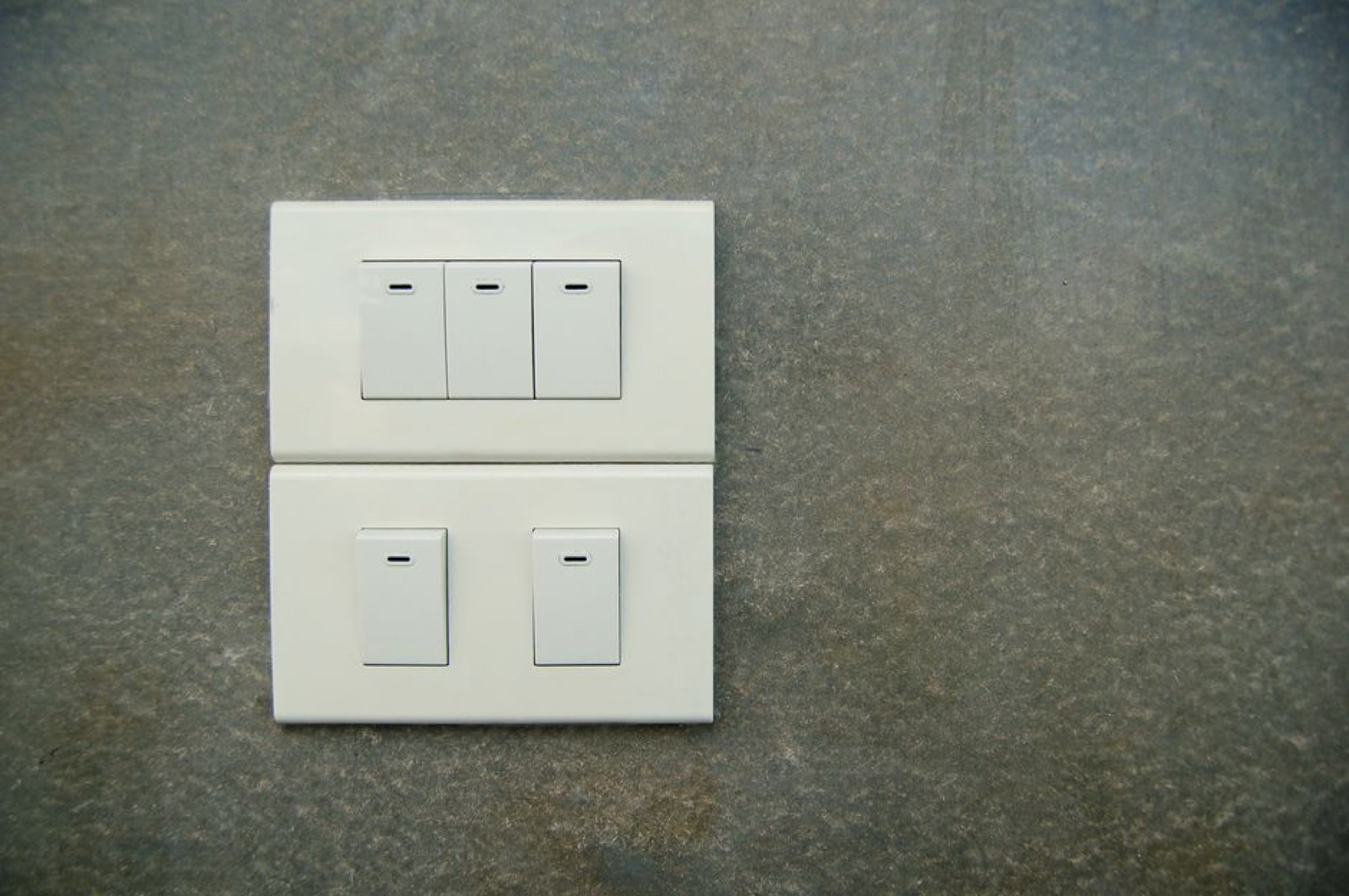
Dimming contributes to comfort at home, but not every LED dims smoothly. Flicker, abrupt jumps and audible drivers are particularly disruptive in the premium segment. The ZVEI information sheet Dimmen von LED-Lichtquellen makes clear that LEDs can be dimmed effectively, but incandescent dimmers are not automatically compatible. Even the label “LED dimmer” does not guarantee compatibility with every dimmable LED lamp, because the interface between dimmer and integrated lamp electronics is not uniformly standardised. licht.wissen 14 adds that old dimmers are usually unsuitable; humming and flickering occur when driver and dimmer do not match. Check manufacturer approvals and compatibility lists and test in the room, ideally with dim-to-warm solutions if you want the light to become warmer as it dims.
Fewer scenes with clear names are better than many unused profiles. The plan determines which layers dim together and which remain independent. That keeps luxury residential lighting calm rather than theatrical.
Existing homes often rely on a single central ceiling light. It brightens the middle and leaves corners, walls and seating areas underlit. The room feels smaller and busier, even when there are enough watts.
A second mistake is deciding on switches and circuits too late. Once plaster and parquet are finished, every extra cable becomes expensive and visible. If you take home lighting seriously, finalise the electrical plan before deciding on finishes.
Third: too many designer fixtures without a shared colour temperature or glare control. The look feels curated, but the light is unsettled. Fourth: task lighting is missing where it is needed. Brighter ambient light is meant to replace it, producing excessive light without benefit.
Existing properties demand compromises, but not arbitrary choices. Surface-mounted profiles, existing outlets and furniture lighting can add layers if the logic is sound. Without a plan, the result is a patchwork: expensive individual pieces with a weak overall effect.
The conclusion is simple: put budget and attention into lighting layers, colour temperature and controls first, then furniture and objects. Keep that order and you protect the effect of the furnishings while avoiding costly alterations that never quite catch up visually.
Surface-mounted profiles, existing outlets and furniture lighting can work in an existing property if the layering is clear. Fixed ceiling recesses and wall washers are harder to add later. Visible fixtures complement the room and only partly fill the missing architectural layer. A plan before individual purchases remains essential.
Manufacturer approvals and compatibility lists are the first filter. ZVEI guidance says each dimmer and LED electronics combination must be checked because the interface is not uniform. Testing in the room reveals flicker, jumps and audible drivers early. If you want the light to warm deliberately as it dims, choose dim-to-warm solutions and test them before installation.
Living areas generally suit warm white light between around 2,700 and 3,300 Kelvin. Cooler values suit places where alertness and contrast take priority, such as a kitchen area or desk. Different colour temperatures in the same field of view often create visual unease. Balancing daylight, room colour and use matters more than rigid Kelvin values.
Rooms with character, materials with history and the light between them. Stay in //Living.