Never Bored in Your Closet Again – The Color Trends of 2019
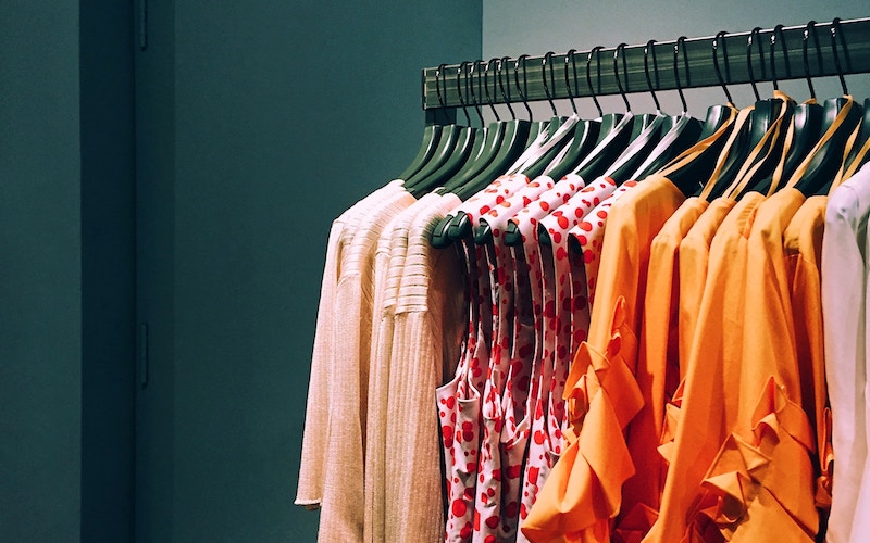
Ugh, it’s Monday morning again, you’re standing in front of your closet and simply can’t decide what to wear?
In 2019, we wrote about color trends because Monday mornings in front of the closet are sometimes tougher than any trend report. The original article drew on Cosmopolitan and positioned color as a way out of the outfit dilemma: color blocking, blue tones, earthy nuances, and pink.
- Cosmopolitan was cited in the article as the source for the color trends.
- Color and color blocking were intended to help with the morning outfit dilemma.
- Royal blue paired with baby blue was described as a possible combination.
- Gold, earth, and brown tones were associated with platinum blonde or rust-red tinted hair.
- Pink was named as a favorite color but should be used strategically.
The wardrobe needs clearer decisions, not more pieces
The original piece began with the familiar Monday morning scene: standing in front of the closet, unsure what to wear. This scenario is mundane yet strikingly true. Often, it’s not a lack of clothes but a lack of direction. Color can help because it instantly organizes. A blue look feels different from an earthy one; pink differs from peach.
The article used Cosmopolitan as a reference point, discussing color trends and fashion colors of the year. More interesting than the year itself is the function. Color can set a mood, elevate a simple cut, and make familiar pieces look new. You don’t need to replace your entire wardrobe. You just need to combine more consciously.
Color works best when it doesn’t beg for attention.
This applies especially to colourblocking. Bold colors side by side can look powerful, but they require discipline. A color mix doesn’t mean wearing everything at once. The old text said it itself: even a beautiful blend of a single hue can work well. That is often more elegant.
Blue and earth are the calm solutions
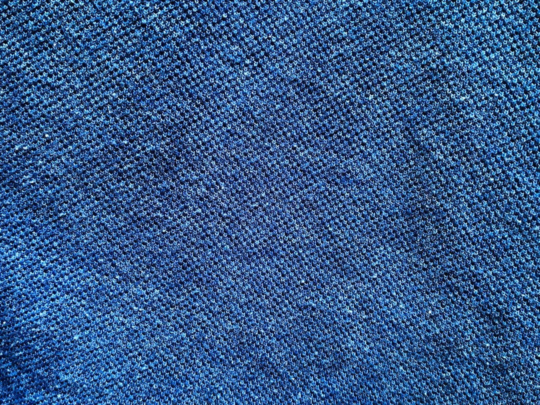
Royal blue paired with soft baby blue was one of the examples. This combination works because it stays within one color family while still providing contrast. Royal blue brings depth, while baby blue softens the harshness. Together, they create a look that is colorful without becoming hectic.
Gold, earth, and brown tones were also highlighted in the archive text. They appear warmer and more natural. Particularly in combination with platinum blonde hair or a rust-red hair tone, the text saw this as a strong direction. You don’t need to take these hair examples literally. The key idea is this: color never stands alone. Skin, hair, material, and light change it.
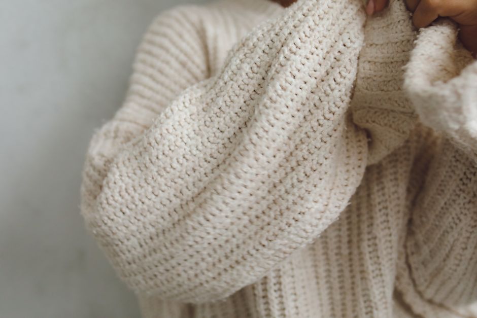
Earth tones are also favorable because they pair well with existing basics. Brown trousers, a golden sweater, a beige coat, or a rusty accent soften a look without being boring. For those approaching color gradually, this offers a calmer entry point than neon or hard contrasts.
Pink requires poise and moderation
The old text named pink in all its facets as a personal favorite trend, winking at Barbie. At the same time, it warned against using pink too broadly, as it can quickly become very “Barbie-like.” This limitation is important. Pink is strong. It forgives little arbitrariness.
Used deliberately, pink can look excellent: as a blazer, shoe, bag, lip color, or a single knit piece. If the rest remains calm, the color appears intentional. If everything is pink and the material, cut, and occasion don’t align, the look tips into costume territory.
Peach was also mentioned in the text, such as in a classic blazer. This softer variant is more accessible and often more suitable for everyday wear. It brings freshness without immediately demanding the spotlight. Especially in the office or with light summer looks, peach can appear more elegant than a hard rose.
How to bring color into your daily life
Don’t start with the loudest color, but with one you truly want to wear. A royal blue, an earth tone, or a targeted pink is enough. Then build the look around it. Shoes, bags, and jewelry shouldn’t need to explain the color. They should only accompany it.
The archive text aimed to make mornings easier. That is the right benchmark. Color should not overwhelm you further. It should take decisions away. If you know blue suits you, reaching for it becomes easier. If pink only works on days when you want to be seen, that is also a valuable insight.
Good style doesn’t emerge because every season calls for new colors. It emerges when you recognize which tones give you energy and which disguise you. The old text was a trend piece. Today, it serves as a useful reminder: sometimes the wardrobe doesn’t need more choices, but a clear color concept.
Color Needs a Calm Frame
The original color copy made you want to be bold, but bold doesn’t mean chaotic. A colorful look needs a frame to appear high-quality. That could be neutral trousers, understated shoes, a clean cut, or a single color family. Then the color can speak without the entire outfit shouting.
Colourblocking is particularly striking when applied intentionally. Royal blue and baby blue work because they’re related. Pink works if it isn’t accompanied by five other visual signals. Earthy and brown tones look great when fabric and skin tone complement them. Color is never just color. It reacts to everything around it.
This archive piece helps because it doesn’t just name one color; it shows several entry points. You can start soft with peach, clear with blue, warm with earth tones, or visible with pink. The best approach is the one where you don’t feel like you’re in costume. That’s when color truly makes your morning easier.
The IBL Perspective
As an archive refresh, this text shouldn’t pretend old news is new. Its strength lies in reading that past observation more clearly. What was merely timely, what remains as a stance, and what can you still draw from today? Exactly this distinction turns legacy content into a piece that fits seamlessly back into the page.
For you, that means: Take the concrete details seriously, but not every bit of past hype. Good archive pieces work when they preserve a moment while becoming calmer. They don’t show what you must immediately buy, eat, wear, or book. They show what to pay attention to when style, daily life, and enjoyment are thoughtfully combined.
Quick Answers
▸Which source did the article cite?
The text referred to Cosmopolitan as the source for color trends and fashion colors.
▸Which shades of blue were combined?
Royal blue and baby blue were mentioned as an example.
▸Which warm tones appeared?
Gold, earth, and brown tones.
▸How should pink be worn?
Purposefully and consciously, since too much pink can quickly look like a costume.