Essay · Book Design
Book design decides how it feels to hold it
The book decides how it feels before you read the first sentence. The text block, typeface, and paper shape the rhythm of your reading.

 Books & Film
The book decides how it feels before you read the first sentence. The text block, typeface, and paper shape the rhythm of your reading.
You take a book from the shelf and sense immediately whether it feels right. The weight in your hand, the resistance when you open it, the way the pages fall. These things are no accident. They are the result of decisions that shape your reading before the first sentence begins.
The text block on a page holds a particular relationship to the margins. Too little margin and the page feels cramped. The eye has no place to rest. Too much margin and the text loses its tension. It floats on the paper. Good design finds a measure where the text breathes and is held at the same time.
These decisions often follow ancient proportions that have proven themselves over centuries. Sometimes they follow a new intuition. What matters is that the reader does not perceive the margins as an obstacle. The text block is good when you do not notice it. You simply keep reading, without the feeling that the page is too tight or too empty.
A good text typeface has a quiet presence. The letters stand neither too close nor too far apart. The serifs guide the eye from one letter to the next. A typeface that is too playful or too rigid forces the reader to read more slowly or tire more quickly. The right typeface almost disappears. It lets the text speak.
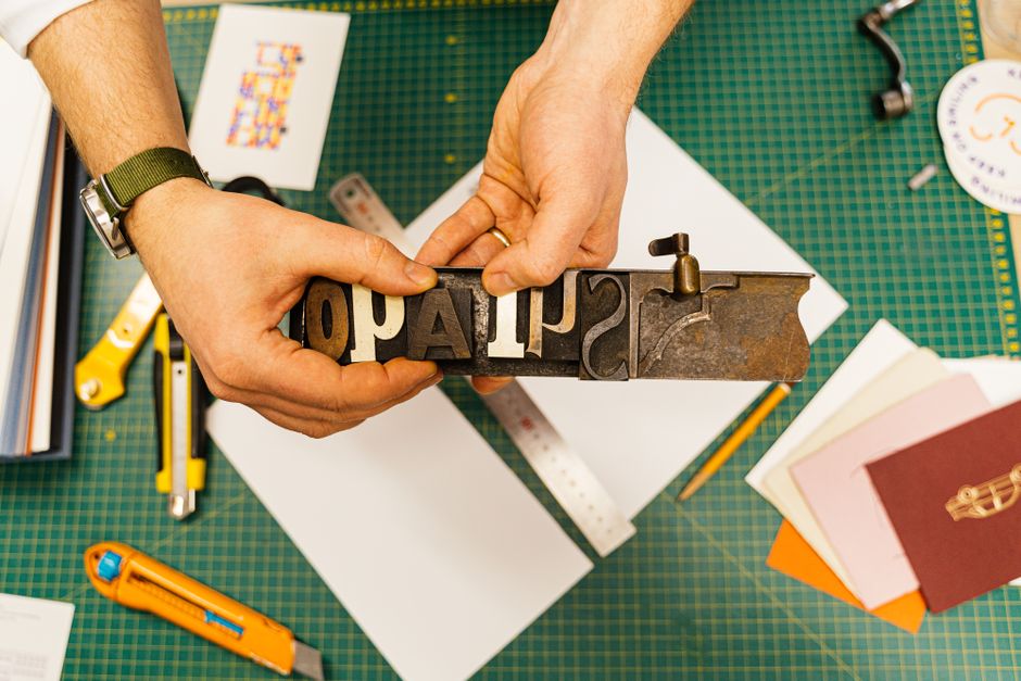
Choosing a typeface is always also a decision about the book’s stance. A serif typeface can convey warmth and tradition. A sans-serif typeface can signal clarity and presence. Both are possible. What matters is whether the typeface matches the content and the physical form of the book. A slim novel and a substantial essay demand different typographic characters.
The surface of the paper determines how the book feels. A lightly textured paper receives the ink in a particular way. It reflects the light more softly than a smooth paper. It makes a quiet sound when you turn the page. These sensory qualities influence how long you read without you noticing it.
Opacity is equally important. When the text shows through from the back, it disrupts the flow of reading. Paper that is too thick makes the book heavy and stiff. Paper that is too thin makes it fragile. The right choice lies in the middle. The paper should be perceptible without pushing itself into the foreground. It should carry the text, not compete with it.
The dust jacket is the public face of the book. It presents the title and author in a way meant to stand out on the shelf. It is often removed during reading. Then the actual binding shows itself. It can be linen or paper. It can carry an embossment or remain plain. This inner binding is often more restrained and more durable.
Design reveals itself in these layers. A good book can be viewed in different ways. It works on the shelf, in the hand, and on the table. The reader decides which layer to see. The best design draws no attention to itself. It ensures the book feels coherent as a whole. You hold it and it feels right. Nothing more is needed.
Paper is the body of the text. It influences how long you can read without tiring your eyes. It influences how the book lies in your hand and how the pages fall. A book with poor paper quickly becomes unpleasant. A book with good paper invites you to stay in it longer.
With a good edition, you forget the design after a few pages. The text flows. The pages have a pleasing weight. The margins do not intrude. With a poor edition, you constantly notice that something is wrong. The text is set too tightly. The pages are too thin. You constantly have to readjust your grip because the book feels unpleasant.
Most books you keep are not read only once. Even with a single reading, design influences how deeply the text reaches you. A book that feels good is read more slowly and more attentively. The physical experience and the mental experience are inseparable. Improving one improves the other.


